Going Native
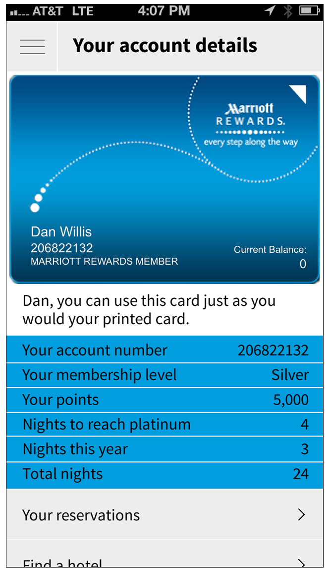
/Content display is based on what is known about each user.
PROJECT
Native App Design
CLIENT
Marriott International
ROLES
Director of Mobile Experience Design (staff), designer
PROBLEM
Up until the redesign, Marriott had published its mobile products on the constrained and idiosyncratic Kony platform. Marriott's future business success depended on launching truly native iOS and Android apps.
SOLUTION
Marriott's digital products are defined by the organization's legacy systems. Business rules are generally inflexible and occasionally inscrutable. Crafting a successful mobile app design required optimizing platform value while navigating the many practical limitations of room search, booking and Marriott Rewards systems.
I designed the experience around content strategy, specifically the primary concept that the more we knew about the user, the more we could do to help them. That led to the design of four user states:
- Not signed in
- Signed in with no upcoming reservations
- Signed in with an upcoming reservation
- Signed in during a stay
I also introduced four pervasive design tactics:
- Design for fat fingers
- Use platform conventions unless they hinder the experience
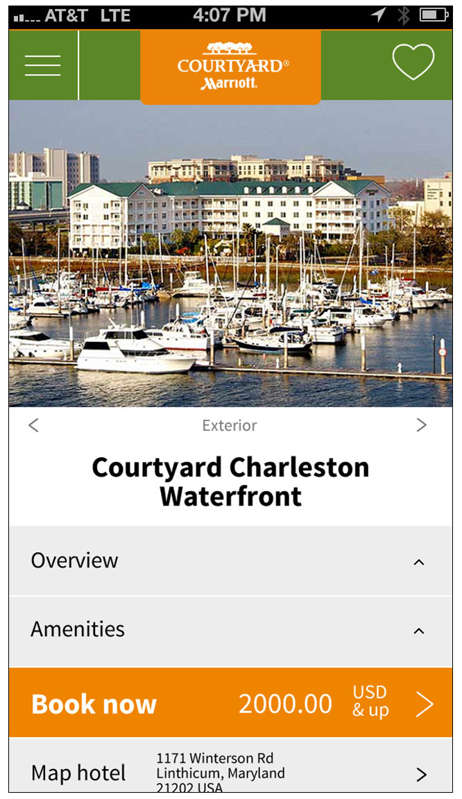
- Help the user imagine wonderful hotel stays with strong imagery
- Align with marriott.com design system standards, especially for branding
The design strategy was a radical departure for Marriott mobile products and our development vendor resisted my approach and design tactics, but by constant stakeholder and design management, I was able to steer my solution through the organization. (The redesign launched a full year after I left Marriott, but the key aspects of the design survived through to implementation.)
Select an image to view it larger.


